Vivid Sydney
Vivid Sydney
mobile application
mobile application
Enhancing Community Engagement at Vivid Sydney
Enhanching Community
Engagement at Vivid Sydney


Date
July - November 2024
ROLE
Product Designer
team members
Ismail Shaadmaan Syed
Tanvi Kapur
Tara Boonkhun
skills
User Research
Wireframing
Prototyping
Tools
Figma
FigJam
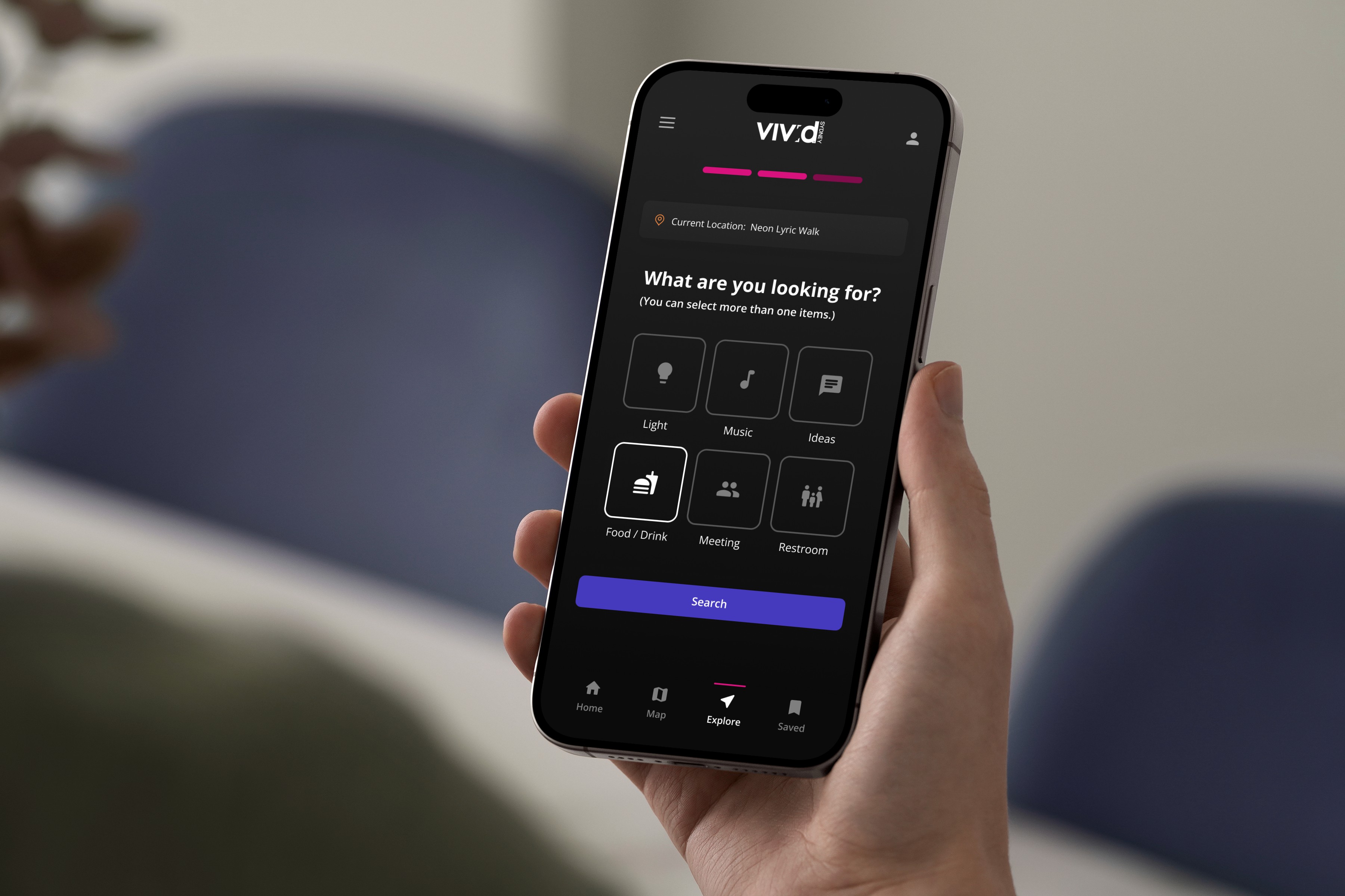
Vivid Sydney is Australia's biggest festival of light, music, ideas, and food. From our secondary research, Vivid as we know it today is popular among a vast array of communities, including young professionals, families, professional photographers, artists, and more. Consequently, we see this as an opportunity to build a digital solution to help foster social interaction and community engagement among attendees at Vivid Sydney.
To narrow down the scope for the design project, we selected one user flow from the user journey maps to be represented on each platform (mobile phone, smartwatch, and tablet) based on suitability. I was responsible for designing the mobile phone platform, and the selected flow is when the user searches for food and restroom facilities to visit between events, as users are most likely to use their phones to perform this task due to convenience.
project overview
The Problem
According to our secondary research, the main user pain points in this phase of the user journey are:
Difficulty finding available seating at food venues
Inability to gauge crowding at different locations
Unexpected public transport issues
Safety concerns for families with children
The Goal
To improve the user experience, our mobile platform solution aims to help users make a more informed decision in less amount of time by providing the following information:
Real-time crowd density trends
Expected waiting time and travel duration
Traffic alerts
Live updates of different locations within Vivid Sydney festival
design solution overview

The Solution
Our design solution introduces the “Explore Nearby” feature on the Landing Page. This feature asks the user to confirm their current location before presenting location type options that the user can select from. After the user has made their selections, the search results are displayed. User can choose refine the search results using the “Filters” feature. On the “Results” screen, the user can tap the location card to see the details about the destination they are interested in and start navigation directly from the details page.
user research
Online
Ethnography
After the background research, we conducted an online ethnography from Reddit, Instagram, and TripAdvisor to observe and analyze the behaviors and real-time conversations of diverse participants. We selected this research method as it enabled us to collect real-time data and different perspectives. From this process, we discovered the following insights into how people engage with the event, what drives their participation and what barriers they face:

Personas
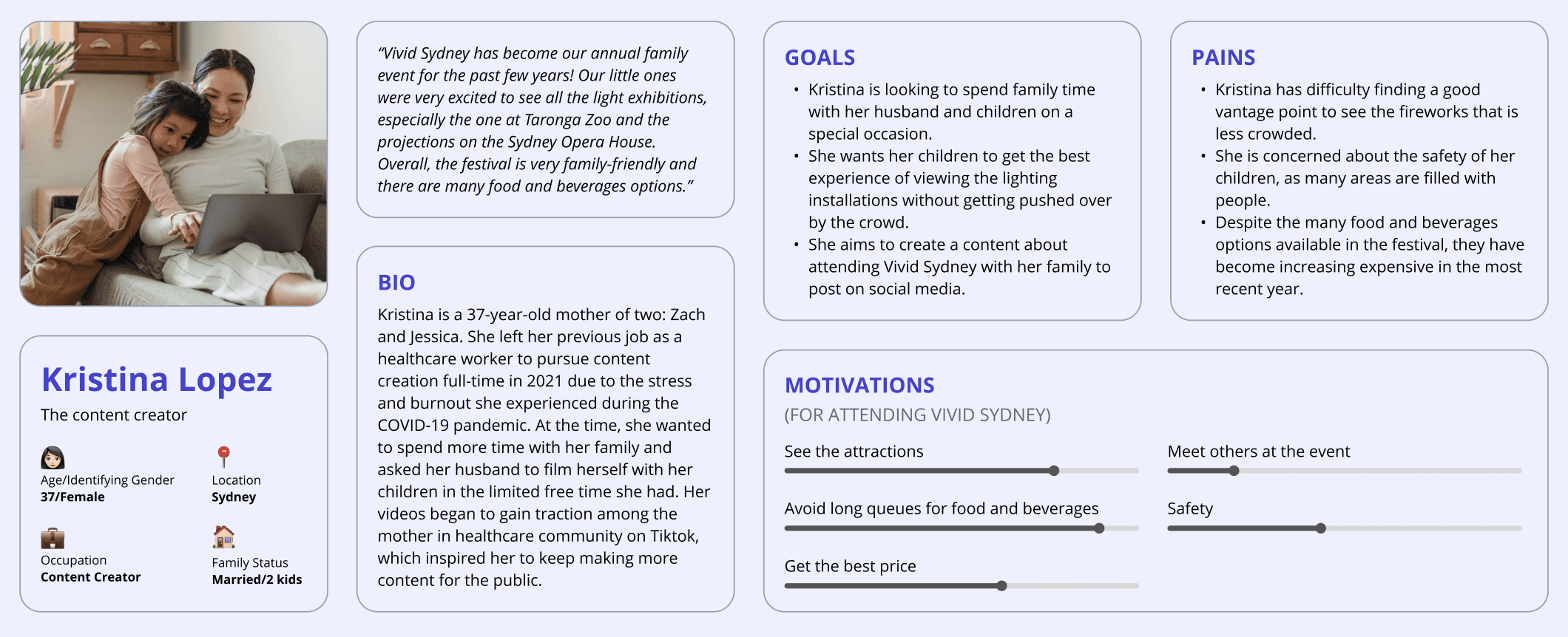
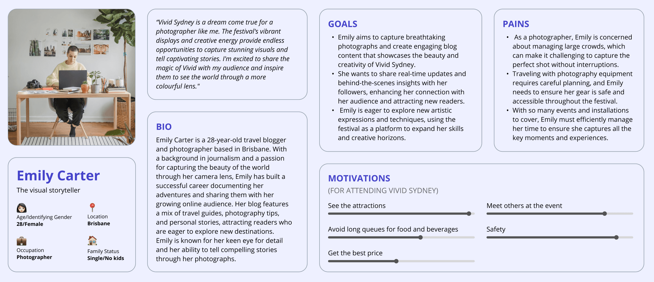
Based on the online ethnography, we developed two personas that represent Vivid Sydney attendees —
The first persona, Kristina Lopez, is a 37-year old content creator from Sydney who left her healthcare job to pursue “momfluencing” full-time in 2021. Her goals for attending the festival include to spend more time with her family and to create content to post on social media.
The second persona, Emily Carter, is a 28-year-old photographer from Brisbane who has built a successful career documenting her adventures and sharing them online. By attending Vivid Sydney, Emily aims to capture beautiful photographs and create engaging blog content.
Jobs To Be Done
Next, we created jobs-to-be-done (JTBD) statements to describe the high-level goals of each persona. The opportunity score for each statement was calculated based on the importance vs satisfaction scores. From the total of 13 jobs-to-be-done statements, the two with the highest opportunity scores are listed below:

Journey Map
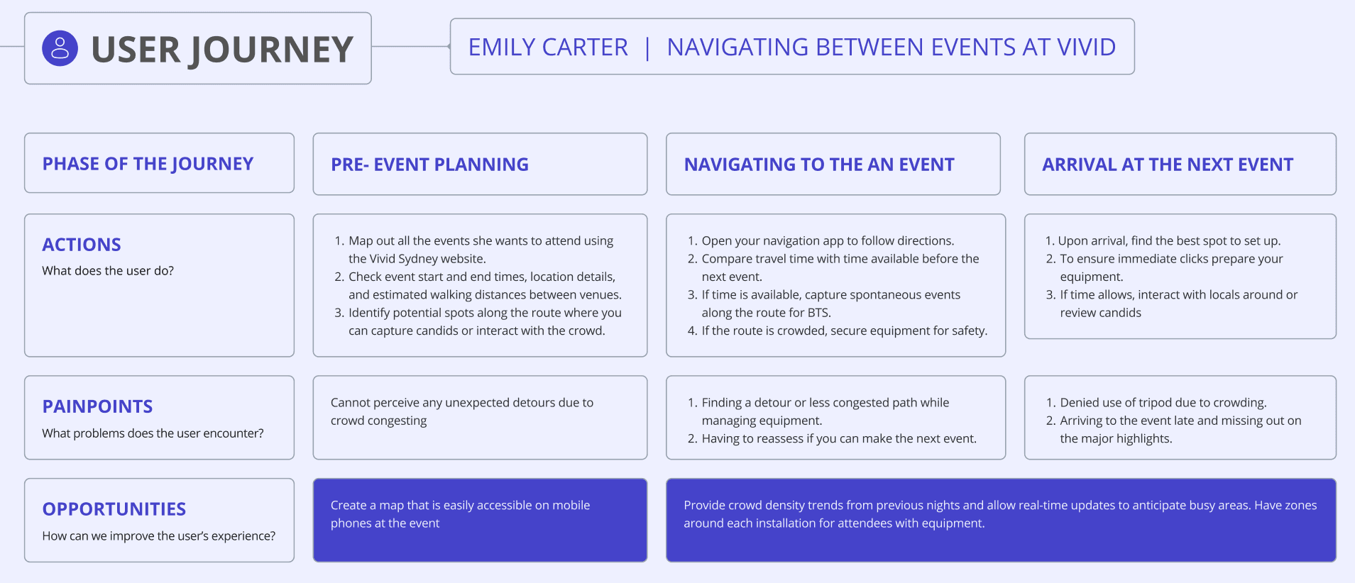
We chose one JTBD that we consider as most impactful for each persona and mapped the details on our user journey maps. For Emily Carter, we looked at how she navigates between events at Vivid. Some critical pain points that Emily experiences are the consequences of overcrowding at the event, ranging from unexpected detours to safety concerns for her photography equipment. To improve the user experience, we see an opportunity to create a mobile map, provide crowd density trends, and to designate zones for attendees with equipment.
final design
User Flow &
Final Screens
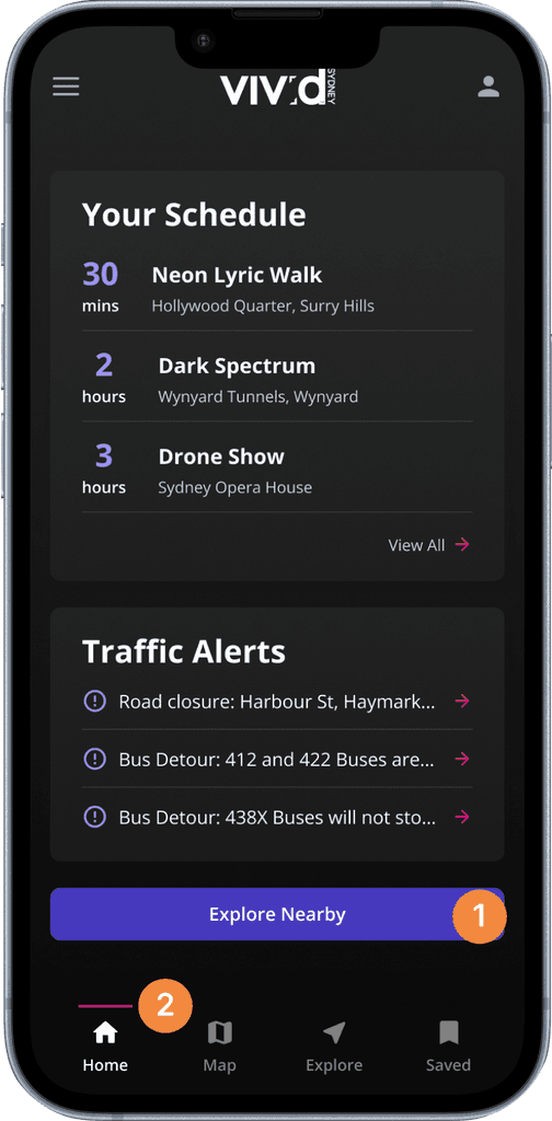
The final user flow for the "Explore Nearby" feature consists of 6 key screens, including the "Landing Page", "Check In", "Location Type", "Results", and "Location Details". Users can activate the "Filters" function from the "Results" screen, which will appear as an overlay modal sheet when tapped.

Landing Page
1
“Explore Nearby” Call-To-Action button is placed in the Hand-reach Comfort Zone to ensure that users can access the feature easily and comfortably.
2
The active destination in the navigation bar has a brighter color than the inactive destinations. Additionally, there is an active indicator line above the active destination to further emphasize the active state.
Check In
3
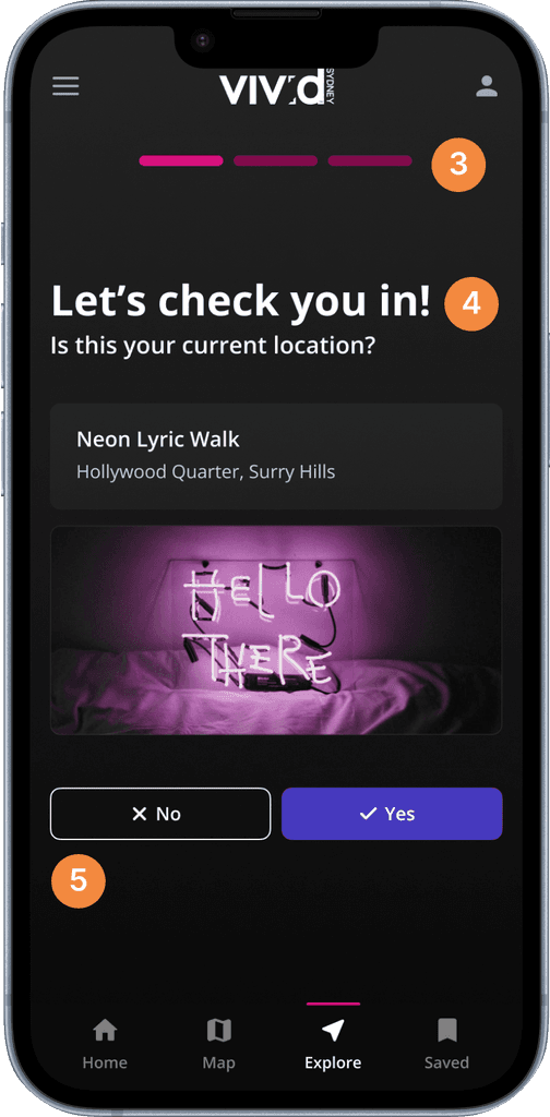
A linear progress indicator is placed in the top center area of the screen to help manage user’s expectation as they go through the searching process. The user can also tap the completed bar to go back to previous steps.
4
The prompts are written and asked with a casual tone of voice to create a more personalized searching experience for the user. This can help establish trust and credibility.
5
If the user taps “No”, the app will ask the user to type their current location. If the user taps “Yes”, the app will bring the user to the next step in the process.
Location Type
6
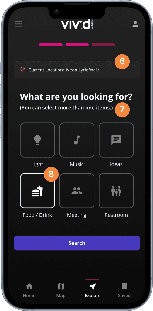
The selected location is shown to help the user recognize their input in the previous step, which follows the heuristic principle of “Recognition Rather Than Recall”.
7
Although the tap-to-select gesture is common among various mobile apps, providing a guiding text can help users to become confident that multiple items can be selected at the same time.
8
Based on Hick’s Law, the more choices users are presented with, the longer it will take for them to make a decision. To prevent this analysis paralysis, only the 6 most searched categories are presented to the user in a grid of icons format.
Results
9
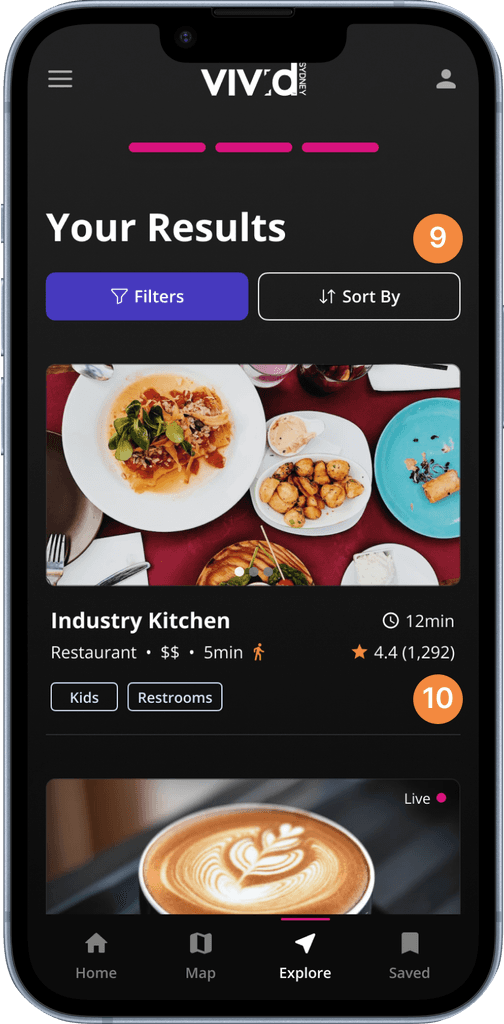
The “Sort By” feature is separated from “Filters” in order to simplify the navigation hierarchy and increase the efficiency of use.
10
The waiting time and travel time are displayed in each card to help the user arrive at their decision more quickly.
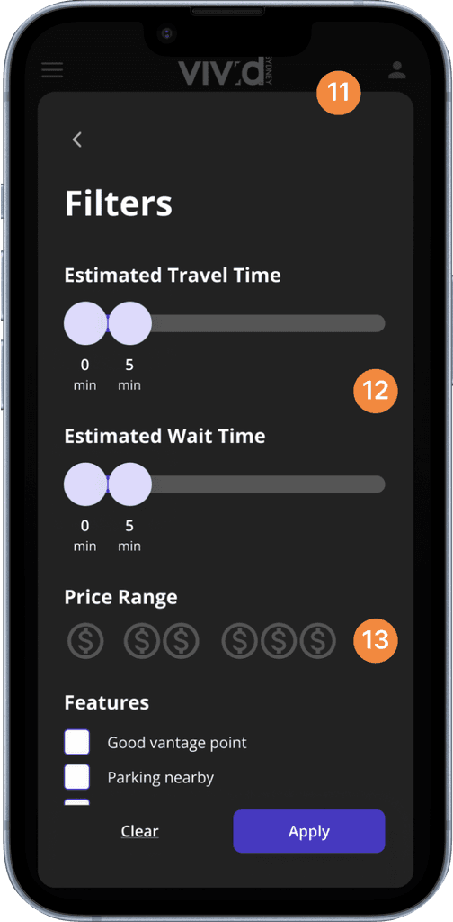
Filters
11
“Filters” screen is displayed as a modal sheet, which is a useful technique for requesting the user to complete specific actions before returning to the parent view.
12
The slider controls are designed to snap to 15-minute increments in order to create a helpful constraint that can prevent the user from making mistakes.
13
The "Price Range" filter accepts multiple selections from the user at the same time.
Location Details
14
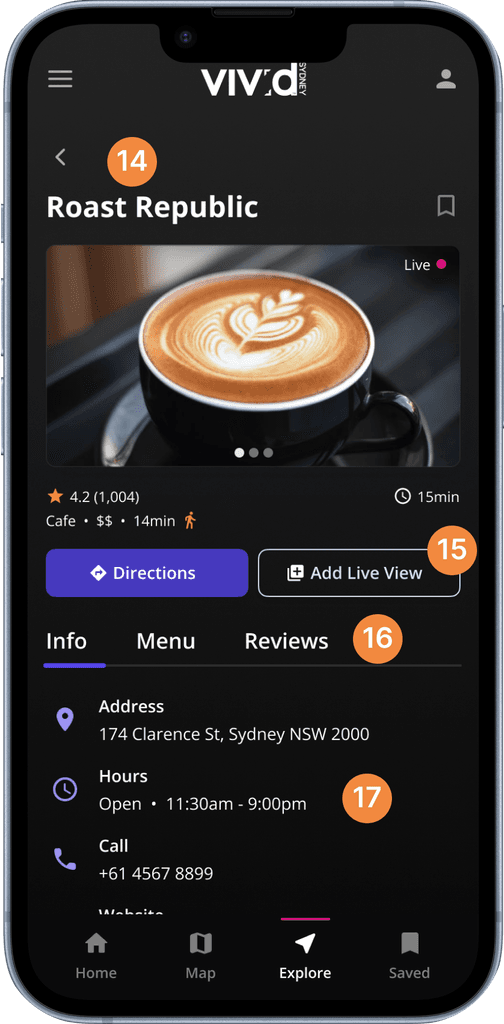
Both the “Filters” and “Location Details” screens contains a button that allows the user to go back to the “Results” page.
15
To distinguish the levels of significance between the “Directions” and the “Add Live View” buttons, the primary button style is applied to one, while the secondary button style is applied to another.
16
Tab menu allows the user to view a single panel of selected content from a list of options.
17
The 8-point based spacing system used to separate the groupings of content helps to establish a clear separation between each subsection and increases readability.
previous iterations
Location Type
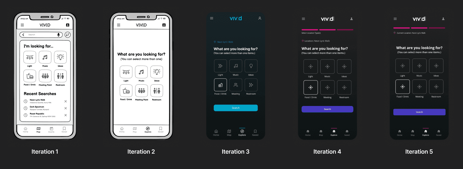
The “Location Type” screen was the screen that went through the highest number of iterations, as the goal is to provide a personalized destination searching experience that is different from other existing navigation apps. In iteration 1, too much flexibility can lead to a paradox of choice for the user. Therefore, the experience is simplified in Iteration 2. A call-to-action button is added in Iteration 3, as the user cannot proceed in the process without one given that multiple categories can be selected. Here, the current location label is also introduced. After the design system is developed, color styles and text styles are implemented in Iteration 4. Last but not least, Iteration 5 explored different placements of the current location label and the text alignments.
reflect
Takeaways
Since this was an academic project for an introductory Interface Design course, it focuses more on understanding and implementing different design principles rather than solving user problems that are ties to business requirements. Moreover, the course instructed students to use online ethnography as the only method of user research, which might represent only a small portion of total visitors of Vivid Sydney.
If I could redo the project without the constraints of the classroom, I would conduct user interviews to supplement the data that we gathered from online sources. Additionally, if I could continue the project, I would conduct a user testing to test if our product can actually help to alleviate the user pain points as we hypothesized. The KPIs that I would measure are the time it takes for user to decide on their next destination, the satisfaction with the choice they made, and the overall experience using our product vs using other existing apps to solve the problem.
Date
July - November 2024
ROLE
Product Designer
team members
Ismail Shaadmaan Syed
Tanvi Kapur
Tara Boonkhun
skills
User Research
Wireframing
Prototyping
Tools
Figma
FigJam
Vivid Sydney is Australia's biggest festival of light, music, ideas, and food. From our secondary research, Vivid as we know it today is popular among a vast array of communities, including young professionals, families, professional photographers, artists, and more. Consequently, we see this as an opportunity to build a digital solution to help foster social interaction and community engagement among attendees at Vivid Sydney.
To narrow down the scope for the design project, we selected one user flow from the user journey maps to be represented on each platform (mobile phone, smartwatch, and tablet) based on suitability. I was responsible for designing the mobile phone platform, and the selected flow is when the user searches for food and restroom facilities to visit between events, as users are most likely to use their phones to perform this task due to convenience.
project overview
The Problem
According to our secondary research, the main user pain points in this phase of the user journey are:
Difficulty finding available seating at food venues
Inability to gauge crowding at different locations
Unexpected public transport issues
Safety concerns for families with children
The Goal
To improve the user experience, our mobile platform solution aims to help users make a more informed decision in less amount of time by providing the following information:
Real-time crowd density trends
Expected waiting time and travel duration
Traffic alerts
Live updates of different locations within Vivid Sydney festival
design solution overview

The Solution
Our design solution introduces the “Explore Nearby” feature on the Landing Page. This feature asks the user to confirm their current location before presenting location type options that the user can select from. After the user has made their selections, the search results are displayed. User can choose refine the search results using the “Filters” feature. On the “Results” screen, the user can tap the location card to see the details about the destination they are interested in and start navigation directly from the details page.
user research
ResearchMethods
After the background research, we conducted an online ethnography from Reddit, Instagram, and TripAdvisor to observe and analyze the behaviors and real-time conversations of diverse participants. We selected this research method as it enabled us to collect real-time data and different perspectives. From this process, we discovered the following insights into how people engage with the event, what drives their participation and what barriers they face:

Personas
Based on the online ethnography, we developed two personas that represent Vivid Sydney attendees —
The first persona, Kristina Lopez, is a 37-year old content creator from Sydney who left her healthcare job to pursue “momfluencing” full-time in 2021. Her goals for attending the festival include to spend more time with her family and to create content to post on social media.
The second persona, Emily Carter, is a 28-year-old photographer from Brisbane who has built a successful career documenting her adventures and sharing them online. By attending Vivid Sydney, Emily aims to capture beautiful photographs and create engaging blog content.


Jobs To Be Done
Next, we created jobs-to-be-done (JTBD) statements to describe the high-level goals of each persona. The opportunity score for each statement was calculated based on the importance vs satisfaction scores. From the total of 13 jobs-to-be-done statements, the two with the highest opportunity scores are listed below:

Journey Map
We chose one JTBD that we consider as most impactful for each persona and mapped the details on our user journey maps. For Emily Carter, we looked at how she navigates between events at Vivid. Some critical pain points that Emily experiences are the consequences of overcrowding at the event, ranging from unexpected detours to safety concerns for her photography equipment. To improve the user experience, we see an opportunity to create a mobile map, provide crowd density trends, and to designate zones for attendees with equipment.

final design
User Flow &
Final Screens
The final user flow for the "Explore Nearby" feature consists of 6 key screens, including the "Landing Page", "Check In", "Location Type", "Results", and "Location Details". Users can activate the "Filters" function from the "Results" screen, which will appear as an overlay modal sheet when tapped.


Landing Page
1
“Explore Nearby” Call-To-Action button is placed in the Hand-reach Comfort Zone to ensure that users can access the feature easily and comfortably.
2
The active destination in the navigation bar has a brighter color than the inactive destinations. Additionally, there is an active indicator line above the active destination to further emphasize the active state.
Check In
3
A linear progress indicator is placed in the top center area of the screen to help manage user’s expectation as they go through the searching process. The user can also tap the completed bar to go back to previous steps.
4
The prompts are written and asked with a casual tone of voice to create a more personalized searching experience for the user. This can help establish trust and credibility.
5
If the user taps “No”, the app will ask the user to type their current location. If the user taps “Yes”, the app will bring the user to the next step in the process.


Location Type
6
The selected location is shown to help the user recognize their input in the previous step, which follows the heuristic principle of “Recognition Rather Than Recall”.
7
Although the tap-to-select gesture is common among various mobile apps, providing a guiding text can help users to become confident that multiple items can be selected at the same time.
8
Based on Hick’s Law, the more choices users are presented with, the longer it will take for them to make a decision. To prevent this analysis paralysis, only the 6 most searched categories are presented to the user in a grid of icons format.
Results
9
The “Sort By” feature is separated from “Filters” in order to simplify the navigation hierarchy and increase the efficiency of use.
10
The waiting time and travel time are displayed in each card to help the user arrive at their decision more quickly.


Filters
11
“Filters” screen is displayed as a modal sheet, which is a useful technique for requesting the user to complete specific actions before returning to the parent view.
12
The slider controls are designed to snap to 15-minute increments in order to create a helpful constraint that can prevent the user from making mistakes.
13
The "Price Range" filter accepts multiple selections from the user at the same time.
Location Details
14
Both the “Filters” and “Location Details” screens contains a button that allows the user to go back to the “Results” page.
15
To distinguish the levels of significance between the “Directions” and the “Add Live View” buttons, the primary button style is applied to one, while the secondary button style is applied to another.
16
Tab menu allows the user to view a single panel of selected content from a list of options.
17
The 8-point based spacing system used to separate the groupings of content helps to establish a clear separation between each subsection and increases readability.

previous iterations
Location Type
The “Location Type” screen was the screen that went through the highest number of iterations, as the goal is to provide a personalized destination searching experience that is different from other existing navigation apps. In iteration 1, too much flexibility can lead to a paradox of choice for the user. Therefore, the experience is simplified in Iteration 2. A call-to-action button is added in Iteration 3, as the user cannot proceed in the process without one given that multiple categories can be selected. Here, the current location label is also introduced. After the design system is developed, color styles and text styles are implemented in Iteration 4. Last but not least, Iteration 5 explored different placements of the current location label and the text alignments.

reflect
Takeaways
Since this was an academic project for an introductory Interface Design course, it focuses more on understanding and implementing different design principles rather than solving user problems that are ties to business requirements. Moreover, the course instructed students to use online ethnography as the only method of user research, which might represent only a small portion of total visitors of Vivid Sydney.
If I could redo the project without the constraints of the classroom, I would conduct user interviews to supplement the data that we gathered from online sources. Additionally, if I could continue the project, I would conduct a user testing to test if our product can actually help to alleviate the user pain points as we hypothesized. The KPIs that I would measure are the time it takes for user to decide on their next destination, the satisfaction with the choice they made, and the overall experience using our product vs using other existing apps to solve the problem.
Let’s Connect - Let’s connect - Let’s connect -
©2025
TARA BOONKHUN
Let’s Connect - Let’s connect - Let’s connect -
©2025
TARA BOONKHUN
Let’s Connect - Let’s connect - Let’s connect -
©2025
TARA BOONKHUN